Chapter 3 The Histogram
3.1 Chapter Notes
Going to race through this chapter since I’m already reasonably familiar with histograms.
Here’s one from the chapter:
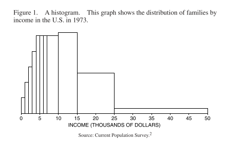
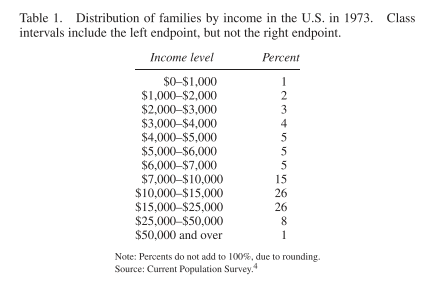
The data given is not split into even intervals in this case. The area of each block is proportional to the number of families with incomes in the corresponding class interval. Here’s the data it’s based on:
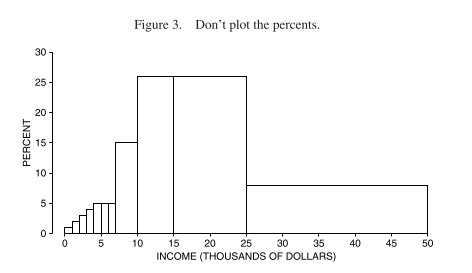
Since the class intervals are of different lengths, we can’t use the percentages given directly as the vertical axis. This would overstate the number of families in the higher income groups, since these are less finely separated. Here is what that would look like:
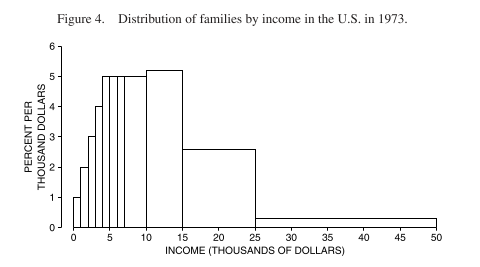
To get the height we should use, we divide the percentage by the length of the interval. The vertical scale is now “percent of families per thousand dollars” (this is called the density scale - how crowded that part of the distribution is) and the area represents the percentage of families in the class interval:
The chapter then goes on to discuss variables - qualitative or quantitative, discrete or continuous, and then discusses controlling for variables. Here the chapter uses the case study of an observational study on the health effects of oral contraceptives. Variables like age may be a confound. We can see the association of oral contraceptives and blood pressure in the following histogram, for ages 25-35:
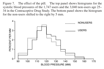
Oral contraceptive users tend to have a blood pressure on average 5mm higher.
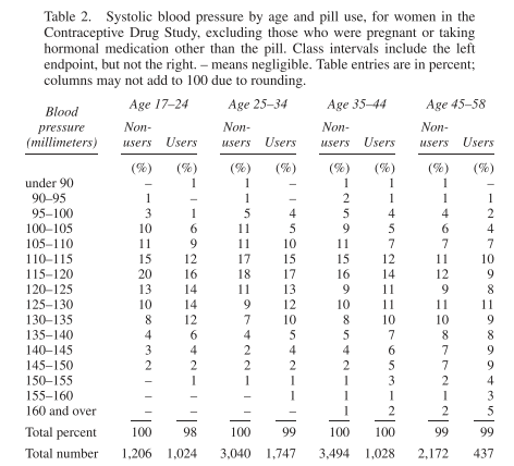
Instead of separating out the age groups graphically, we can show the distribution in a table. This is called cross-tabulation, and looks like this:
There’s a bit at the end of the chapter about selective breeding of rats to look for evidence of Spearman’s g. The experiment found that they could selectively breed for performance on a maze-running task - evidence that some mental abilities are at least partially genetic. However the “maze-bright” rats did not perform better than “maze-dull” rats on other tests of cognition e.g. ability to discriminate geometric shapes.