Chapter 11 The R.M.S. Error for Regression
11.1 Chapter Notes
This chapter introduces the root mean square error as a measure of how much the true values of the \(y\) variable differ from what would be predicted by the regression line. For each point, we measure the distance above or below the regression line and call this the error or residual. It’s positive if the point is above the regression line and negative if it’s below. To get the root mean square error of the regression you square all of the residuals, take the average, and take the square root of the resulting figure.
\[ \sqrt{\frac{(\text{error}_1)^2 + (\text{error}_2)^2 + \dots + (\text{error}_n)^2}{n}} \]
In the case of the height and weight data presented in the chapter the root mean square error is about 41 pounds. This means that a typical point in the data is above or below the regression line by around 41 pounds.
The r.m.s. error for regression says how far typical points are above or below the regression line.
The r.m.s. error is to the regression line as the SD is to the average. For instance, about 68% of the points on a scatter diagram will be within one r.m.s. error of the regression line; about 95% of them will be within two r.m.s. errors. This rule of thumb holds for many data sets, but not all.
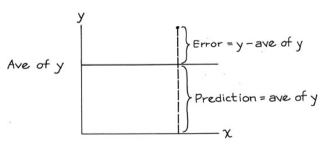
In fact we can think about standard deviation as being the root mean square error of a prediction line drawn horizontally through the average of \(y\) values:
The chapter then goes on to introduce a simpler way of computing the r.m.s error of the regression line, by comparing these two measures. It’s clear that the r.m.s error for the regression line will be smaller than the \(SD\) of the \(y\) variable. The chapter states that the r.m.s error for the regression will be smaller by a factor of \(\sqrt{1-r^2}\).
And so the r.m.s error for the regression line of \(y\) on \(x\) can be computed by:
\[ \sqrt{1-r^2} \times SD_y. \]
It is the \(SD\) of the variable being predicted that goes in this formula. When we are trying to predict weight from height, we want the r.m.s error of the regression to come out in pounds, not inches.
A cautionary note. If you extrapolate beyond the data, or use the line to make estimates for people who are different from the subjects in the study, the r.m.s. error cannot tell you how far off you are likely to be. That is beyond the power of mathematics.
Here’s how residuals are plotted:
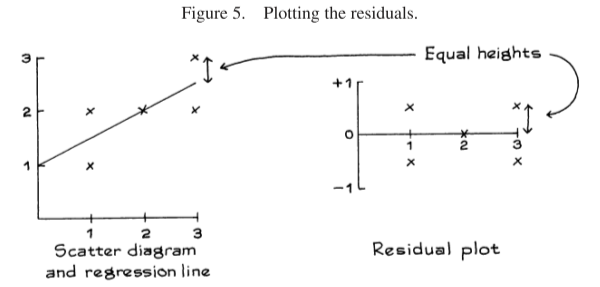
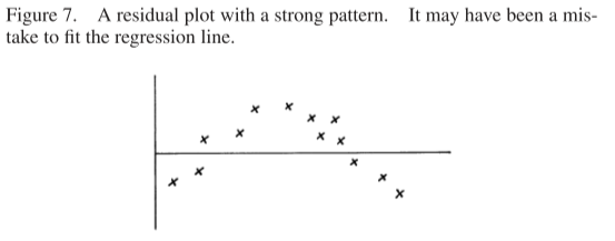
The residuals must average out to zero, and we should expect to see no trend or pattern in the plot. If we do we a pattern, it may indicate non-linearities that make linear regression inappropriate.
The chapter introduces the concept of homoscedasticity.
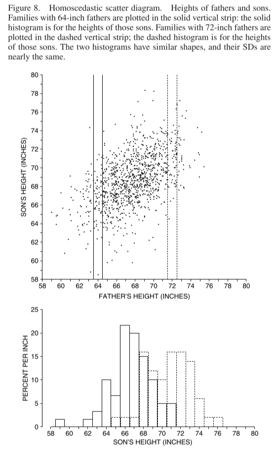
When all the vertical strips in a scatter diagram show similar amounts of spread, the diagram is said to be homoscedastic.The scatter diagram in figure 8 is homoscedastic. The range of sons’ heights for given father’s height is greater in the middle of the picture, but that is only because there are more families in the middle of things than at the extremes. The SD of sons’ height for given father’s height is pretty much the same from one end of the picture to the other.
When a plot of your data is homoscedastic, the prediction errors are similar all along the regression line.
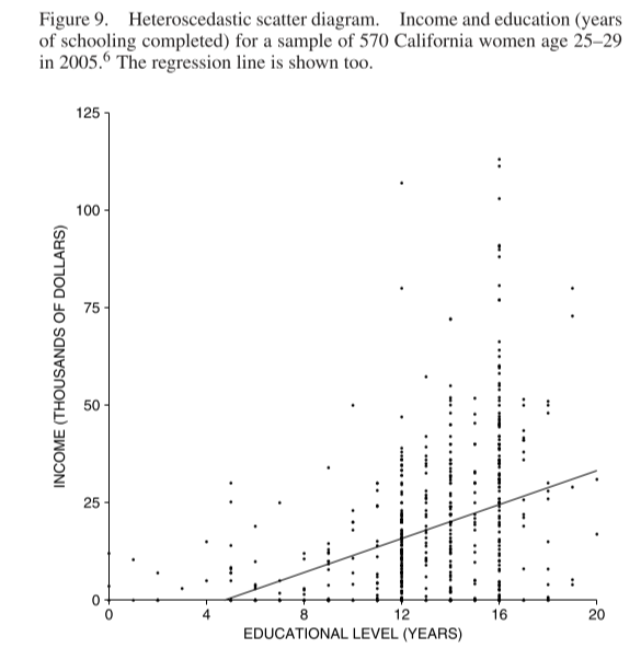
When your data shows heteroscedasticity, the regression line is off by different amounts for different values of the \(x\) variable. In the plot below, as education level increases so does income, but so does spread in income.
When data is homoscedastic and does not show signs of non-linearity, we can use normality assumptions to answer questions like:
Of the students who scored 165 on the LSAT, about what percentage had first-year law school scores over 75?
We find what the regression line predicts for first-year scores given an LSAT score of 165. We then assume a normal distribution about this point with the \(SD\) of this normal curve set to equal the r.m.s. error of the regression (not the \(SD\) of the first-year scores - the students who scored 165 on the LSAT are a smaller and more homogenous group than the overall student population).
Here’s a tip about heteroscedastic or non-linear data:
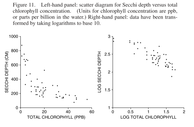
Technical note. What can you do with non-linear or heteroscedastic data? Often a transformation will help — for example, taking logarithms. The left hand panel in figure 11 shows a scatter diagram for Secchi depth (a measure of water clarity) versus total chlorophyll concentration (a measure of algae in the water). The data are non-linear and heteroscedastic. The right hand panel shows the same data, after taking logs: the diagram is more like a football.